
Our Colour Palette
To create a unified look across our multiple district area, we would appreciate you using the colour palette provided here.
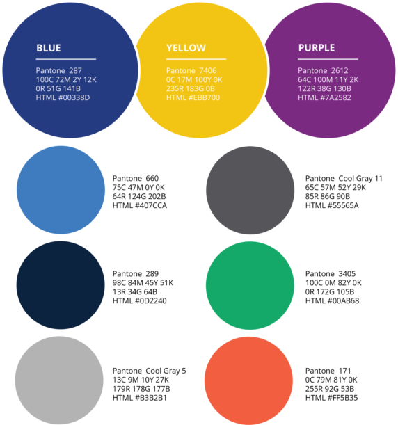
Primary Colour Palette The primary colour palette for Lions International features blue, yellow, and purple. These colours have been carefully selected to complement our refreshed emblem while preserving our distinct brand equity. This primary palette should be widely used for large colour fills, typography, and accent details. | The Secondary Colour Palette The Lions International secondary colour palette is designed to complement our primary colours. These hues extend our brand and should be used sparingly. They serve as excellent accent colours, adding energy and emphasis to your designs. |
Lions clubs operate independently, but one key reason members join is their alignment with the values of our association. By properly utilising the graphic elements, verbal tone, and personality developed by Lions Clubs International, all clubs can communicate clearly and effectively with a unified voice.